Categories
-
Recent Posts
-
To make an appointment or to request a quote, simply complete your details below:
28 Jan
Bringing Pantone’s colour(s) of the year into the home
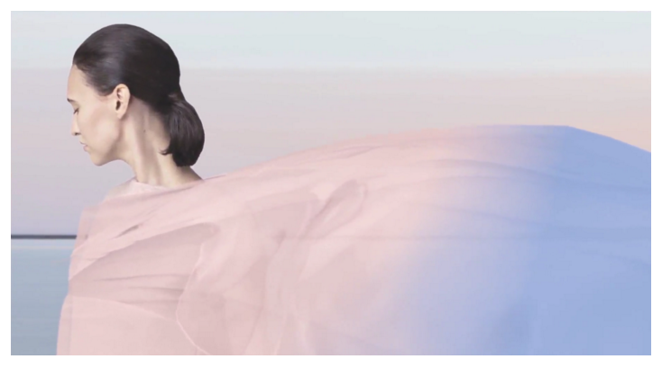
Image: Pantone
If you’re seeking direction for a colour update to your interiors this year, Pantone’s colour of the year is always a good source of inspiration.
Pantone, the world authority on colour, released not one but two shades for 2016 they predicted would capture and influence the world of fashion, interiors and design.
The joint colours, Rose Quartz and Serenity, are said to combine to reflect a soothing palette to create warmth and peace.
“As consumers seek mindfulness and well-being as an antidote to modern day stresses, welcoming colours that psychologically fulfil our yearning for reassurance and security are becoming more prominent.
“Joined together, Rose Quartz and Serenity demonstrate an inherent balance between a warmer embracing rose tone and the cooler tranquil blue, reflecting connection and wellness as well as a soothing sense of order and peace,” it says.
To bring Rose Quartz and Serenity into your home, you may start with small accent colours through accessories in your living area. A blush-coloured vase with a bunch of fresh hydrangeas would work perfectly.
When used as paint colours, Rose Quartz and Serenity can be styled to reflect a vintage look to update a 1950s kitchen for example, or can be paired back with timber and metallic accents for a more up-to-date, contemporary room.
Although these colours are most attractive, and we have used them with delightful effect in previous years, at the end of the day it’s best to choose colour or colours that suit your individual projects and taste. If you’re starting from scratch you’ve obviously got more options.
As always, if you would like to adopt this or any new ideas into your home, our Beadles interior designers are only to happy to offer the expertise and advice to manage your project.
Cheers
Beadles